How to Center a Div in CSS
A practical guide to how to center a div in CSS across real scenarios, from full-page layouts to modals, plus fixes for when it won't work.
On this page
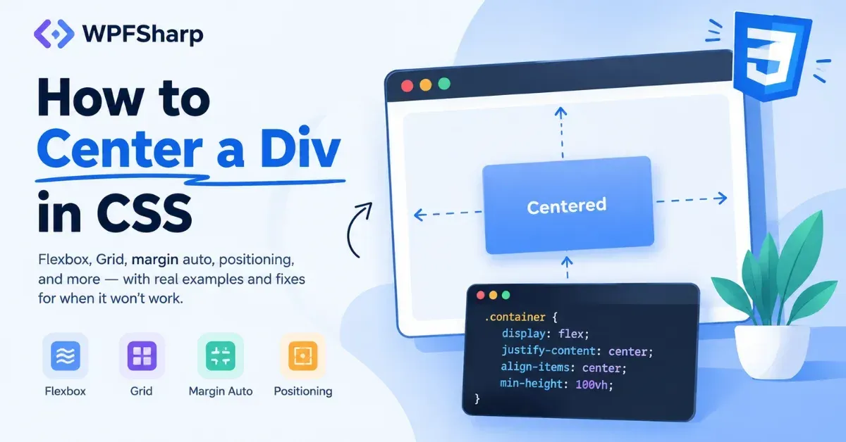
Every developer hits the same wall at some point: a div refuses to sit where it should, and the fix that worked in one layout does nothing in another. That's because centering isn't one problem. It's four different problems wearing the same name, and picking the wrong tool for the specific one you're facing is where most of the frustration comes from.
Here's the fastest fix for the most common case, both-axis centering:
css
.page {
  display: flex;
  justify-content: center;
  align-items: center;
  min-height: 100vh;
}
The rest of this guide breaks down how to center a div in CSS across the situations that actually come up in real projects: full-page layouts, existing components you can't restructure, modals, and grid-based designs.
Why "Center a Div" Actually Means Four Different Things
Before picking a technique, it helps to know which of these you're solving for:
Horizontal only. Equal space on the left and right, nothing to do with vertical position.
Vertical only. Equal space above and below, which needs a parent with usable vertical space.
Both axes. The case most people mean by default, and the one Flexbox handles in a single declaration.
Centered in the viewport. A specific version of both-axis centering where the "parent" is effectively the browser window.
Mixing these up is the root cause behind a lot of "I followed a tutorial and it didn't work" situations, since a horizontal-only technique will never fix a vertical centering problem.
How to Center a Div in CSS on a Full Page or Hero Section
Full-page centering is the same logic as component-level centering, just applied to a container sized to the screen.
html
<body>
  <div class="page">
    <div class="card">Welcome back</div>
  </div>
</body>
css
.page {
  display: flex;
  justify-content: center;
  align-items: center;
  min-height: 100vh;
}
min-height rather than a fixed height matters here. A fixed height: 100vh clips content that ends up taller than the screen; min-height lets the page grow instead.
On mobile, 100vh is calculated using the largest possible viewport, the size you get when the browser's address bar is hidden. When that bar is actually visible, like right after the page loads, the real visible area is smaller than 100vh accounts for, so full-height content can extend below the fold. 100dvh, the dynamic viewport height unit, tracks the actual visible area in real time and has solid support across current browsers, so it's the more reliable choice for full-page or hero sections on mobile-heavy sites:
css
.page {
  min-height: 100dvh;
}
CSS Grid does the same job in fewer lines, useful when the centered element doesn't need any other layout logic around it:
css
.page {
  display: grid;
  place-items: center;
  min-height: 100vh;
}
place-items: center is shorthand for align-items and justify-items together, centering a grid item on both axes without touching the child at all.
Keeping an Element Centered Inside an Existing Layout
Sometimes restructuring the parent isn't an option, and the element just needs to center itself horizontally within whatever it's dropped into.
css
.sidebar-widget {
  width: 80%;
  max-width: 400px;
  margin-inline: auto;
}
margin-inline: auto splits the leftover horizontal space evenly between both sides, which pushes the element to the center. This works as long as the element isn't already filling the full available width; a width, max-width, or percentage all count as valid ways to leave that space, it doesn't have to be a specific fixed pixel value.
A common trap: an element at width: 100% will never visibly center with this technique, no matter how it's written, because there's no leftover space left to split. margin-inline is the modern, direction-aware equivalent of the older margin: 0 auto, and it's had solid browser support since 2021, so there's little reason to reach for the older syntax on a new project.
Centering With CSS Grid Instead of Flexbox
Grid and Flexbox both solve centering, but they're not interchangeable once a layout gets more complex than a single centered box.
css
.gallery {
  display: grid;
  place-items: center;
  gap: 1rem;
}
Flexbox is a one-dimensional model, arranging items along a single row or column. Grid is two-dimensional, built for actual rows and columns at once. For a single centered element, either works fine. Once the layout needs real structure, like a photo gallery or dashboard with defined rows and columns, Grid tends to hold up better as things grow more complex.
Centering a Modal, Tooltip, or Overlay
Overlays need to break out of normal document flow, which is exactly what absolute positioning is for.
html
<div class="modal-backdrop">
  <div class="modal">Are you sure you want to continue?</div>
</div>
css
.modal-backdrop {
  position: relative;
  min-height: 100vh;
}

.modal {
  position: absolute;
  top: 50%;
  left: 50%;
  transform: translate(-50%, -50%);
}
top: 50% and left: 50% place the modal's top-left corner at the exact center of its containing block. transform: translate(-50%, -50%) then shifts it back by half of its own width and height, landing it precisely centered regardless of its actual size.
For this to work, .modal-backdrop needs position: relative. An absolutely positioned element sizes itself against its containing block, which is formed by the nearest ancestor with a position value other than static. Skip that, and the modal centers against the whole page instead of its intended wrapper.
A different variant avoids calculating the transform manually:
css
.modal {
  position: absolute;
  inset: 0;
  margin: auto;
  width: fit-content;
  height: fit-content;
}
inset: 0 stretches the positioning edges to all four sides in one line. Combined with margin: auto and a size constrained to fit-content, the element centers itself inside that stretched space. This version also leaves transform free for something else, like a hover or entrance animation, without the two competing for the same property.
The text-align Trap Beginners Fall Into
text-align: center is one of the most reached-for properties for this problem, and one of the most frequently misapplied.
css
.card {
  text-align: center;
}
This property controls how inline-level content, like text or an inline <span>, is aligned within its containing block. It has no effect on the block-level box itself. A div stays exactly where normal document flow placed it regardless of text-align, whether it's full-width or narrow. Where it genuinely helps is centering the text or inline elements sitting inside the div, not the div's own position. Confusing those two goals, the box versus its contents, is behind most "text-align isn't working" confusion.
Making Centered Layouts Actually Responsive
A centering technique that only holds up at one screen size isn't finished.
Swap fixed widths for
max-width, so content shrinks gracefully instead of overflowing on small screens.Use
min-heightrather thanheightfor vertically centered sections, so taller content on small screens doesn't get clipped.Add horizontal padding to the parent on narrow viewports, so centered content doesn't touch the screen edges.
Prefer
100dvhover100vhfor anything full-screen on mobile, since it accounts for the browser's address bar changing size.
Troubleshooting: Why Your Div Won't Center
Symptom | Likely Cause | Fix |
|---|---|---|
| The element's width is | Give it a constrained size using |
Vertical centering not working | Container has no usable vertical space | Add |
Flexbox centers the wrong axis |
| Swap |
Modal centers on the wrong element | Nearest ancestor lacks | Add |
| It only affects inline content, not the box itself | Use |
Layout breaks on mobile | Fixed width/height doesn't fit small viewports | Swap to |
Quick Reference: Which Method Fits Your Situation
Situation | Recommended Method |
|---|---|
Horizontal centering only |
|
Both axes, single element | Flexbox |
Rows and columns, not just one box | CSS Grid |
Modal, tooltip, or overlay | Positioned layout with |
Text or inline content inside a box |
|
None of these is universally "the best." The right one depends on what the layout actually needs around the centered element.
Mistakes Worth Avoiding
Reaching for
text-align: centerto move the div itself instead of the content inside it.Assuming
margin: autoalone handles vertical centering, which it doesn't without Flexbox or Grid.Forgetting
position: relativeon the intended parent, so a modal centers on the whole page instead.Using absolute positioning for normal in-flow content, which pulls it out of the layout entirely.
Hard-coding pixel widths where
max-widthwould hold up better across screen sizes.Reaching for
transform: translateto center something when Flexbox or Grid would do it with less code.
FAQ About Centering a Div in CSS
What's the fastest way to center a div in CSS? Flexbox with justify-content: center and align-items: center on the parent handles both axes in two lines.
How do I center a div horizontally only? Constrain its width using width, max-width, or a percentage, then apply margin-inline: auto.
Why isn't margin: auto centering my div? The element is likely filling the full available width already, leaving no space for auto margins to distribute. Constrain its size first.
Why doesn't text-align: center move my div? It only aligns inline content inside the box, not the box's own position. Use margin-inline: auto or Flexbox to move the box itself.
Should I use Flexbox or Grid to center a div? Flexbox for a single centered element; Grid once the layout involves real rows and columns beyond just centering one box.
How do I center a div in the middle of the screen? Apply Flexbox or Grid centering to body or a full-height wrapper, using min-height: 100dvh so it holds up on mobile too.
Can I center a div without using Flexbox? Yes. margin-inline: auto handles horizontal centering, CSS Grid's place-items: center handles both axes, and positioned layouts with transform or inset work for overlays.
The Short Version
Learning how to center a div in CSS really comes down to matching the technique to the layout, not memorizing one universal trick. margin-inline: auto for horizontal-only centering inside an existing layout, Flexbox for a single element on both axes, CSS Grid once real rows and columns are involved, and a positioned layout with transform or inset for anything that needs to break out of the normal flow, like a modal. text-align stays reserved for the content inside a box, never the box itself.
For a deeper look at how Flexbox and Grid handle full page layouts beyond centering, the CSS course on this site covers both from the ground up.
Was this page helpful?
