Archive for the ‘Expression Blend’ Category.

Using Expression Blend and Visual States for Image Swapping

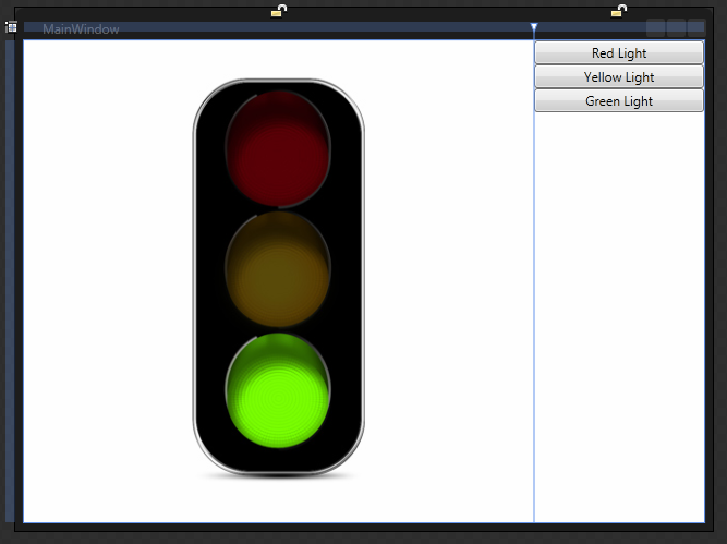
For this example, lets think of a stop light during the traffic of your morning commute. There will be three images of a stop light. Each image will have either the red, yellow, or green light on.

Link: I used traffic light images from here: http://www.psdgraphics.com/psd-icons/traffic-lights-icon-psd

*** This can be done 100% in Expression Blend without using any code at all. ***

Note: This is for both Developers and Designers. It is for designers because they can do all of this without code. It is for Developers because they need to know to not go reinvent the wheel and spend their time writing code to do this.

Step 1 – Create a new WPF Application project

You can do this in either Visual Studio or Expression Blend. For this example, we will use Expression Blend 4.

  1. Open Expression Blend 4.
  2. Go to File | New Project.
  3. Choose WPF Application.
  4. Name the project and click OK.
    Note: I named this project SwitchImagesWithVisualStates.

Step 2 – Add Images to the WPF project

  1. Right-click on your project and choose Add new folder.
  2. Name the folder Images.
  3. Open your file system and copy or drag your images to this new folder in Expression Blend.
    Note: If you copy the images using the windows file system, you may have to add the files to the project.

Step 3 – Design the View

We are going to have a simple view for this example with the images on the left and buttons on the right.

  1. Open MainWindow.xaml.
  2. Add a column to the default Grid, so there are two columns.
  3. Make the columns 3* and 1*. This will make the left column 75% and the right column 25% of the Grid size.
  4. Add all thee images to the left column.
  5. Remove any margins, heights or widths, and vertical or horizontal alignments from the images.
    Note: This is important so the images are always in the same place.
    Note: This assumes that all three of your images are identically sized and properly placed.
  6. Name each Image: ImageRedLight, ImageYellowLight, ImageGreenLight.
  7. Add a StackPanel to the right column.
  8. Remove any margins, heights or widths, and vertical or horizontal alignments from the StackPanel.
  9. Click to select the StackPanel in the Objects and Timeline box.
  10. Add three buttons to the StackPanel in the right column.
  11. Remove any margins, heights or widths, and vertical or horizontal alignments from the buttons.
  12. Name each button: ButtonRedLight, ButtonYellowLight, ButtonGreenLight.
Your View should now look like this in the Expresion Blend designer.

Your Xaml should look like this:

<Window
	xmlns="http://schemas.microsoft.com/winfx/2006/xaml/presentation"
	xmlns:x="http://schemas.microsoft.com/winfx/2006/xaml"
	x:Class="SwitchImagesWithVisualStates.MainWindow"
	x:Name="Window"
	Title="MainWindow"
	Width="640" Height="480">
	<Grid x:Name="LayoutRoot">
		<Grid.ColumnDefinitions>
			<ColumnDefinition Width="3*"/>
			<ColumnDefinition Width="1*"/>
		</Grid.ColumnDefinitions>
		<Image Name="ImageRedLight" Source="Images/Red.png" />
		<Image Name="ImageYellowLight" Source="Images/Yellow.png" />
		<Image Name="ImageGreenLight" Source="Images/Green.png" />
		<StackPanel Grid.Column="1">
			<Button Name="ButtonRedLight" Content="Red Light"/>
			<Button Name="ButtonYellowLight" Content="Yellow Light"/>
			<Button Name="ButtonGreenLight" Content="Green Light"/>
		</StackPanel>
	</Grid>
</Window>

Step 4 – Add VisualStates in a VisualStateGroup

  1. In Expression Studio, click on the States tab.
    Note: Sometimes the States tab is hard to find.
  2. On the top right of the States tab, click icon that has a + sign to add a VisualStateGroup.
  3. Name the VisualStateGroup.
    Note: I named mine VisualStateGroupTrafficLights.
  4. Under the VisualStateGroup you now have another icon with a + sign (the Add state icon) that add a VisualState to the VisualStateGroup. Click it three times to add three VisualStates.
  5. Name the VisualStates: VisualStateRedLight, VisualStateYellowLight, VisualStateGreenLight.

Step 5 – Set new values for each VisualState

  1. Configure the VisualStateRedLight.
    1. Click on VisualStateRedLight.
    2. You will see a red outline around the designer and the words: VisualStateRedLight state recording is on.
    3. In the Objects and Timeline tab, press and hold control and click to select both ImageYellowLight and ImageGreenLight.
    4. Go to the Properties tab.
    5. Change the visibility of the images to Hidden.
  2. Configure the VisualStateYellowLight.
    1. Click on VisualStateYellowLight.
    2. You will see a red outline around the designer and the words: VisualStateYellowLight state recording is on.
    3. In the Objects and Timeline tab, press and hold control and click to select both ImageRedLight and ImageGreenLight.
    4. Go to the Properties tab.
    5. Change the visibility of the images to Hidden.
  3. Configure the VisualStateGreenLight.
    1. Click on VisualStateGreenLight.
    2. You will see a red outline around the designer and the words: VisualStateGreenLight state recording is on.
    3. In the Objects and Timeline tab, press and hold control and click to select both ImageRedLight and ImageYellowLight.
    4. Go to the Properties tab.
    5. Change the visibility of the images to Hidden.

Step 6 – Configure each Button to switch to a VisualState on click

  1. Configure ButtonRedLight.
    1. In Assets, search for GoToStateAction.
    2. Click and drag the GoToStateAction and drop it in the designer over the ButtonRedLight.
    3. Go to Properties.
    4. Name it GoToRedLightState.
    5. Set the StateName to VisualStateRedLight.
  2. Configure ButtonYellowLight.
    1. In Assets, search for GoToStateAction.
    2. Click and drag the GoToStateAction and drop it in the designer over the ButtonYellowLight.
    3. Go to Properties.
    4. Name it GoToYellowLightState.
    5. Set the StateName to VisualStateYellowLight.
  3. Configure ButtonGeenLight.
    1. In Assets, search for GoToStateAction.
    2. Click and drag the GoToStateAction and drop it in the designer over the ButtonGreenLight.
    3. Go to Properties.
    4. Name it GoToGreenLightState.
    5. Set the StateName to VisualStateGreenLight.

That is it. You have now written an application that switches the image.

Here is your final Xaml.

<Window
	xmlns="http://schemas.microsoft.com/winfx/2006/xaml/presentation"
	xmlns:x="http://schemas.microsoft.com/winfx/2006/xaml"
	xmlns:i="http://schemas.microsoft.com/expression/2010/interactivity"
	xmlns:ei="http://schemas.microsoft.com/expression/2010/interactions"
	x:Class="SwitchImagesWithVisualStates.MainWindow"
	x:Name="Window"
	Title="MainWindow"
	Width="640" Height="480">
	<Grid x:Name="LayoutRoot">
		<VisualStateManager.VisualStateGroups>
			<VisualStateGroup x:Name="VisualStateGroupTrafficLights">
				<VisualState x:Name="VisualStateRedLight">
					<Storyboard>
						<ObjectAnimationUsingKeyFrames Storyboard.TargetProperty="(UIElement.Visibility)" Storyboard.TargetName="ImageYellowLight">
							<DiscreteObjectKeyFrame KeyTime="0" Value="{x:Static Visibility.Hidden}"/>
						</ObjectAnimationUsingKeyFrames>
						<ObjectAnimationUsingKeyFrames Storyboard.TargetProperty="(UIElement.Visibility)" Storyboard.TargetName="ImageGreenLight">
							<DiscreteObjectKeyFrame KeyTime="0" Value="{x:Static Visibility.Hidden}"/>
						</ObjectAnimationUsingKeyFrames>
					</Storyboard>
				</VisualState>
				<VisualState x:Name="VisualStateYellowLight">
					<Storyboard>
						<ObjectAnimationUsingKeyFrames Storyboard.TargetProperty="(UIElement.Visibility)" Storyboard.TargetName="ImageRedLight">
							<DiscreteObjectKeyFrame KeyTime="0" Value="{x:Static Visibility.Hidden}"/>
						</ObjectAnimationUsingKeyFrames>
						<ObjectAnimationUsingKeyFrames Storyboard.TargetProperty="(UIElement.Visibility)" Storyboard.TargetName="ImageGreenLight">
							<DiscreteObjectKeyFrame KeyTime="0" Value="{x:Static Visibility.Hidden}"/>
						</ObjectAnimationUsingKeyFrames>
					</Storyboard>
				</VisualState>
				<VisualState x:Name="VisualStateGreenLight">
					<Storyboard>
						<ObjectAnimationUsingKeyFrames Storyboard.TargetProperty="(UIElement.Visibility)" Storyboard.TargetName="ImageRedLight">
							<DiscreteObjectKeyFrame KeyTime="0" Value="{x:Static Visibility.Hidden}"/>
						</ObjectAnimationUsingKeyFrames>
						<ObjectAnimationUsingKeyFrames Storyboard.TargetProperty="(UIElement.Visibility)" Storyboard.TargetName="ImageYellowLight">
							<DiscreteObjectKeyFrame KeyTime="0" Value="{x:Static Visibility.Hidden}"/>
						</ObjectAnimationUsingKeyFrames>
					</Storyboard>
				</VisualState>
			</VisualStateGroup>
		</VisualStateManager.VisualStateGroups>
		<Grid.ColumnDefinitions>
			<ColumnDefinition Width="3*"/>
			<ColumnDefinition Width="1*"/>
		</Grid.ColumnDefinitions>
		<Image x:Name="ImageRedLight" Source="Images/Red.png" />
		<Image x:Name="ImageYellowLight" Source="Images/Yellow.png" />
		<Image x:Name="ImageGreenLight" Source="Images/Green.png" />
		<StackPanel Grid.Column="1">
			<Button x:Name="ButtonRedLight" Content="Red Light">
				<i:Interaction.Triggers>
					<i:EventTrigger EventName="Click">
						<ei:GoToStateAction x:Name="GoToRedLightState" StateName="VisualStateRedLight"/>
					</i:EventTrigger>
				</i:Interaction.Triggers>
			</Button>
			<Button x:Name="ButtonYellowLight" Content="Yellow Light">
				<i:Interaction.Triggers>
					<i:EventTrigger EventName="Click">
						<ei:GoToStateAction x:Name="GoToYellowLightState" StateName="VisualStateYellowLight"/>
					</i:EventTrigger>
				</i:Interaction.Triggers>
			</Button>
			<Button x:Name="ButtonGreenLight" Content="Green Light">
				<i:Interaction.Triggers>
					<i:EventTrigger EventName="Click">
						<ei:GoToStateAction x:Name="GoToGreenLightState" StateName="VisualStateGreenLight"/>
					</i:EventTrigger>
				</i:Interaction.Triggers>
			</Button>
		</StackPanel>
	</Grid>
</Window>

Notice there are additional dependencies added that come from System.Windows.Interactivity.dll:

  1. xmlns:i=”http://schemas.microsoft.com/expression/2010/interactivity”
  2. Mli>xmlns:ei=”http://schemas.microsoft.com/expression/2010/interactions”

There is a lot more to learn. We didn’t even touch Transition or Easing methods. We didn’t discuss how to hook this up into a full application, or possible an MVVM application.
How to load a ResourceDictionary at Design Time in WPF

I am including my ResourceDictionary files as Content files. Content files means they are not compiled or embedded, but they are loose files on disk.

One issue I need to solve was how to have the Design View in Expression Blend or Visual Studio.

It seems that Expression Blend has a partial solution but it doesn’t work in Visual Studio for me.

Steps for loading a ResourceDictionary from a loose file at design time

  1. Locate your .proj file for your WPF Project.
  2. Edit the .proj file with you favorite text editor.
    Note: I use Notepad++.
  3. Find the ResourceDictionary file that is included as content.
        <Content Include="Resources\en-US\Common.View.LocalizationResources.en-US.xaml">
          <Generator>MSBuild:Compile</Generator>
          <SubType>Designer</SubType>
          <CopyToOutputDirectory>PreserveNewest</CopyToOutputDirectory>
        </Content>
    
  4. Change it to this:
        <Content Include="Resources\en-US\Common.View.LocalizationResources.en-US.xaml"
          Condition="'$(DesignTime)'=='true'
          OR ('$(SolutionPath)'!='' AND Exists('$(SolutionPath)')
          AND '$(BuildingInsideVisualStudio)'!='true'
          AND '$(BuildingInsideExpressionBlend)'!='true')">
          <Generator>MSBuild:Compile</Generator>
          <SubType>Designer</SubType>
          <CopyToOutputDirectory>PreserveNewest</CopyToOutputDirectory>
        </Content>
    
  5. Save and close the file.


Loading multiple ResourceDictionary files at design time

Sometimes Expression Blend will prompt you when it can’t find a resource and it will do this for you. However, it does something interesting.

It adds a file called DesignTimeResources.xaml in the Properties folder as a Page (not as Content).

    <Page Include="Properties\DesignTimeResources.xaml" 
      Condition="'$(DesignTime)'=='true' 
      OR ('$(SolutionPath)'!='' 
      AND Exists('$(SolutionPath)') AND '$(BuildingInsideVisualStudio)'!='true' 
      AND '$(BuildingInsideExpressionBlend)'!='true')">
      <Generator>MSBuild:Compile</Generator>
      <SubType>Designer</SubType>
      <ContainsDesignTimeResources>true</ContainsDesignTimeResources>
    </Page>

The file then looks as follows:

<ResourceDictionary
    xmlns="http://schemas.microsoft.com/winfx/2006/xaml/presentation" 
    xmlns:x="http://schemas.microsoft.com/winfx/2006/xaml">
    <ResourceDictionary.MergedDictionaries>        
        <ResourceDictionary Source="E:\Dev\LD\Trunk\install\Common\LANDesk.Install.Common\Resources\en-US\Common.LocalizationResources.en-US.xaml"/>
    </ResourceDictionary.MergedDictionaries>
    <!-- Resource dictionary entries should be defined here. -->
</ResourceDictionary>

And then you can add more ResourceDictionaries without modifying the .proj file.

<ResourceDictionary
    xmlns="http://schemas.microsoft.com/winfx/2006/xaml/presentation" 
    xmlns:x="http://schemas.microsoft.com/winfx/2006/xaml">
    <ResourceDictionary.MergedDictionaries>
        <ResourceDictionary Source="E:\Dev\LD\Trunk\install\SomeApp\Branding\StyleResources.xaml"/>
        <ResourceDictionary Source="E:\Dev\LD\Trunk\install\SomeApp\Branding\AlternateStyleResources.xaml"/>
        <ResourceDictionary Source="E:\Dev\LD\Trunk\install\SomeApp\Resources\en-US\en-US.xaml"/>
    </ResourceDictionary.MergedDictionaries>
    <!-- Resource dictionary entries should be defined here. -->
</ResourceDictionary>

ResourceDictionary with Relative Paths

Of course relative paths are more desired than static paths, especially when using projects among multiple people and from source control.

<ResourceDictionary
    xmlns="http://schemas.microsoft.com/winfx/2006/xaml/presentation" 
    xmlns:x="http://schemas.microsoft.com/winfx/2006/xaml">
    <ResourceDictionary.MergedDictionaries>
        <ResourceDictionary Source="..\Branding\StyleResources.xaml"/>
        <ResourceDictionary Source="..\Branding\AlternateStyleResources.xaml"/>
        <ResourceDictionary Source="..\Resources\en-US\en-US.xaml"/>
    </ResourceDictionary.MergedDictionaries>
    <!-- Resource dictionary entries should be defined here. -->
</ResourceDictionary>

Resources:
http://www.tweened.org/en/2010/06/07/design-time-resources-dans-blend-4/

How to have the TextBlock in a left column of a Grid in a ListView Template expand or shrink with text wrapping?

Ok, lets say you want to have a Grid where each item is a row of data in a Grid. The left most column should expand or shrink, and yes the text should wrap when it shrinks.

Not so easy…but it can be done if you use the right tools.

  • Use a DockPanel not a Grid
  • Make the left most column the last one added
<Window x:Class="ListBoxWithWrap.MainWindow"
        xmlns="http://schemas.microsoft.com/winfx/2006/xaml/presentation"
        xmlns:x="http://schemas.microsoft.com/winfx/2006/xaml"
        Title="MainWindow"
        mc:Ignorable="d" xmlns:d="http://schemas.microsoft.com/expression/blend/2008"
        xmlns:mc="http://schemas.openxmlformats.org/markup-compatibility/2006"
        d:DesignHeight="242"
        d:DesignWidth="388"
        >
    <Grid>
        <DockPanel Name="MainGrid" HorizontalAlignment="Stretch">
            <!-- These four blocks will have other content eventually, but only need to be 45 wide -->
            <TextBlock Text="X" Grid.Column="1" HorizontalAlignment="Center" Width="45" DockPanel.Dock="Right"/>
            <TextBlock Text="X" Grid.Column="2" HorizontalAlignment="Center" Width="45" DockPanel.Dock="Right"/>
            <TextBlock Text="X" Grid.Column="3" HorizontalAlignment="Center" Width="45" DockPanel.Dock="Right"/>
            <TextBlock Text="X" Grid.Column="4" HorizontalAlignment="Center" Width="45" DockPanel.Dock="Right"/>
            <!-- This is the TextBlock that needs to wrap its content (and
                             change the height of the row (so the full content is still
                             visible) to whatever the available space is, but should not
                             make overall ListView wider than the parent's width. -->
            <TextBlock Text="A very long string that should wrap when the window is small." Padding="20,6,6,6" TextWrapping="Wrap" DockPanel.Dock="Right"/>
        </DockPanel>
    </Grid>
</Window>

You will see that this works as you desire.

Now put this in a ListView’s Template and set it to use Binding.

<Window x:Class="ListBoxWithWrap.MainWindow"
        xmlns="http://schemas.microsoft.com/winfx/2006/xaml/presentation"
        xmlns:x="http://schemas.microsoft.com/winfx/2006/xaml"
        Title="MainWindow"
        mc:Ignorable="d"
        xmlns:d="http://schemas.microsoft.com/expression/blend/2008"
        xmlns:mc="http://schemas.openxmlformats.org/markup-compatibility/2006"
        d:DesignHeight="242"
        d:DesignWidth="388"
        SizeToContent="WidthAndHeight">
    <Grid>
        <ListView Name="lvWrap" ItemsSource="{Binding}">
            <ListView.ItemTemplate>
                <DataTemplate>
                    <DockPanel Name="MainGrid" HorizontalAlignment="Stretch">
                        <!-- These four blocks will have other content eventually, but only need to be 45 wide -->
                        <TextBlock Text="X" Grid.Column="1" HorizontalAlignment="Center" Width="45" DockPanel.Dock="Right"/>
                        <TextBlock Text="X" Grid.Column="2" HorizontalAlignment="Center" Width="45" DockPanel.Dock="Right"/>
                        <TextBlock Text="X" Grid.Column="3" HorizontalAlignment="Center" Width="45" DockPanel.Dock="Right"/>
                        <TextBlock Text="X" Grid.Column="4" HorizontalAlignment="Center" Width="45" DockPanel.Dock="Right"/>
                        <!-- This is the TextBlock that needs to wrap its content (and
                             change the height of the row (so the full content is still
                             visible) to whatever the available space is, but should not
                             make overall ListView wider than the parent's width. -->
                        <TextBlock Text="{Binding Content}" Padding="20,6,6,6" TextWrapping="Wrap" DockPanel.Dock="Right"/>
                    </DockPanel>
                </DataTemplate>
            </ListView.ItemTemplate>
        </ListView>
    </Grid>
</Window>

Now give it some data to bind to.

using System.Collections.Generic;
using System.Windows;
using System.Windows.Documents;

namespace ListBoxWithWrap
{
    /// <summary>
    /// Interaction logic for MainWindow.xaml
    /// </summary>
    public partial class MainWindow : Window
    {
        public MainWindow()
        {
            InitializeComponent();

            List<SomeItem> list = new List<SomeItem>();
            list.Add(new SomeItem() { Content = "Some very long string with so many words there should be some wrapping going on to prevent a line of text that is too long" });
            list.Add(new SomeItem() { Content = "Some very long string with so many words there should be some wrapping going on to prevent a line of text that is too long" });
            list.Add(new SomeItem() { Content = "Some very long string with so many words there should be some wrapping going on to prevent a line of text that is too long" });
            list.Add(new SomeItem() { Content = "Some very long string with so many words there should be some wrapping going on to prevent a line of text that is too long" });
            list.Add(new SomeItem() { Content = "Some very long string with so many words there should be some wrapping going on to prevent a line of text that is too long" });

            lvWrap.DataContext = list;
        }

        public class SomeItem
        {
            public string Content { get; set; }
        }
    }
}

The shrink with text wrapping no longer works once inside of the ListView. So that tells you that something to do with the ListView is breaking the feature you want.

Here is how you fix this:

1. Open your project in Expression Blend. (If you don’t have Expression Blend, maybe just look at my code below and copy it)

2. Right-Click on the ListView in the Object and Timeline tab and choose Edit Template | Edit a Copy.

3. Click OK on the next Window.

This will create the following resource code.

<Window.Resources>
		<SolidColorBrush x:Key="ListBorder" Color="#828790"/>
		<Style x:Key="ListViewStyle1" TargetType="{x:Type ListView}">
			<Setter Property="Background" Value="{DynamicResource {x:Static SystemColors.WindowBrushKey}}"/>
			<Setter Property="BorderBrush" Value="{StaticResource ListBorder}"/>
			<Setter Property="BorderThickness" Value="1"/>
			<Setter Property="Foreground" Value="{DynamicResource {x:Static SystemColors.ControlTextBrushKey}}"/>
			<Setter Property="ScrollViewer.HorizontalScrollBarVisibility" Value="Auto"/>
			<Setter Property="ScrollViewer.VerticalScrollBarVisibility" Value="Auto"/>
			<Setter Property="ScrollViewer.CanContentScroll" Value="true"/>
			<Setter Property="ScrollViewer.PanningMode" Value="Both"/>
			<Setter Property="Stylus.IsFlicksEnabled" Value="False"/>
			<Setter Property="VerticalContentAlignment" Value="Center"/>
			<Setter Property="Template">
				<Setter.Value>
					<ControlTemplate TargetType="{x:Type ListView}">
						<Border x:Name="Bd" BorderBrush="{TemplateBinding BorderBrush}" BorderThickness="{TemplateBinding BorderThickness}" Background="{TemplateBinding Background}" Padding="1" SnapsToDevicePixels="true">
							<ScrollViewer Focusable="false" Padding="{TemplateBinding Padding}">
								<ItemsPresenter SnapsToDevicePixels="{TemplateBinding SnapsToDevicePixels}"/>
							</ScrollViewer>
						</Border>
						<ControlTemplate.Triggers>
							<Trigger Property="IsEnabled" Value="false">
								<Setter Property="Background" TargetName="Bd" Value="{DynamicResource {x:Static SystemColors.ControlBrushKey}}"/>
							</Trigger>
							<Trigger Property="IsGrouping" Value="true">
								<Setter Property="ScrollViewer.CanContentScroll" Value="false"/>
							</Trigger>
						</ControlTemplate.Triggers>
					</ControlTemplate>
				</Setter.Value>
			</Setter>
		</Style>
	</Window.Resources>

4. Now look at what is surrounding the ItemPresenter. Yes, you see the ScrollViewer, which is your problem. Delete it.

5. Build you project.

Success! Now your feature to both expand or shrink with text wrapping is back.

Here is the final XAML.

<Window x:Class="ListBoxWithWrap.MainWindow"
        xmlns="http://schemas.microsoft.com/winfx/2006/xaml/presentation"
        xmlns:x="http://schemas.microsoft.com/winfx/2006/xaml"
        Title="MainWindow"
        mc:Ignorable="d"
        xmlns:d="http://schemas.microsoft.com/expression/blend/2008"
        xmlns:mc="http://schemas.openxmlformats.org/markup-compatibility/2006"
        d:DesignHeight="242"
        d:DesignWidth="388"
        SizeToContent="WidthAndHeight">
    <Window.Resources>
        <SolidColorBrush x:Key="ListBorder" Color="#828790"/>
        <Style x:Key="ListViewStyle1" TargetType="{x:Type ListView}">
            <Setter Property="Background" Value="{DynamicResource {x:Static SystemColors.WindowBrushKey}}"/>
            <Setter Property="BorderBrush" Value="{StaticResource ListBorder}"/>
            <Setter Property="BorderThickness" Value="1"/>
            <Setter Property="Foreground" Value="{DynamicResource {x:Static SystemColors.ControlTextBrushKey}}"/>
            <Setter Property="ScrollViewer.HorizontalScrollBarVisibility" Value="Auto"/>
            <Setter Property="ScrollViewer.VerticalScrollBarVisibility" Value="Auto"/>
            <Setter Property="ScrollViewer.CanContentScroll" Value="true"/>
            <Setter Property="ScrollViewer.PanningMode" Value="Both"/>
            <Setter Property="Stylus.IsFlicksEnabled" Value="False"/>
            <Setter Property="VerticalContentAlignment" Value="Center"/>
            <Setter Property="Template">
                <Setter.Value>
                    <ControlTemplate TargetType="{x:Type ListView}">
                        <Border x:Name="Bd" BorderBrush="{TemplateBinding BorderBrush}" BorderThickness="{TemplateBinding BorderThickness}" Background="{TemplateBinding Background}" Padding="1" SnapsToDevicePixels="true">
                            <ItemsPresenter SnapsToDevicePixels="{TemplateBinding SnapsToDevicePixels}"/>
                        </Border>
                        <ControlTemplate.Triggers>
                            <Trigger Property="IsEnabled" Value="false">
                                <Setter Property="Background" TargetName="Bd" Value="{DynamicResource {x:Static SystemColors.ControlBrushKey}}"/>
                            </Trigger>
                            <Trigger Property="IsGrouping" Value="true">
                                <Setter Property="ScrollViewer.CanContentScroll" Value="false"/>
                            </Trigger>
                        </ControlTemplate.Triggers>
                    </ControlTemplate>
                </Setter.Value>
            </Setter>
        </Style>
    </Window.Resources>
    <Grid>
        <ListView Name="lvWrap" ItemsSource="{Binding}" Style="{DynamicResource ListViewStyle1}">
            <ListView.ItemTemplate>
                <DataTemplate>
                    <DockPanel Name="MainGrid" HorizontalAlignment="Stretch">
                        <!-- These four blocks will have other content eventually, but only need to be 45 wide -->
                        <TextBlock Text="X" Grid.Column="1" HorizontalAlignment="Center" Width="45" DockPanel.Dock="Right"/>
                        <TextBlock Text="X" Grid.Column="2" HorizontalAlignment="Center" Width="45" DockPanel.Dock="Right"/>
                        <TextBlock Text="X" Grid.Column="3" HorizontalAlignment="Center" Width="45" DockPanel.Dock="Right"/>
                        <TextBlock Text="X" Grid.Column="4" HorizontalAlignment="Center" Width="45" DockPanel.Dock="Right"/>
                        <!-- This is the TextBlock that needs to wrap its content (and
                             change the height of the row (so the full content is still
                             visible) to whatever the available space is, but should not
                             make overall ListView wider than the parent's width. -->
                        <TextBlock Text="{Binding Content}" Padding="20,6,6,6" TextWrapping="Wrap" DockPanel.Dock="Right"/>
                    </DockPanel>
                </DataTemplate>
            </ListView.ItemTemplate>
        </ListView>
    </Grid>
</Window>

You should now have a little bit more understanding of the ListView template and how to manipulate it, which should translate to other objects in WPF as well.

How to animate an edit box to slide in and out using Expression Blend

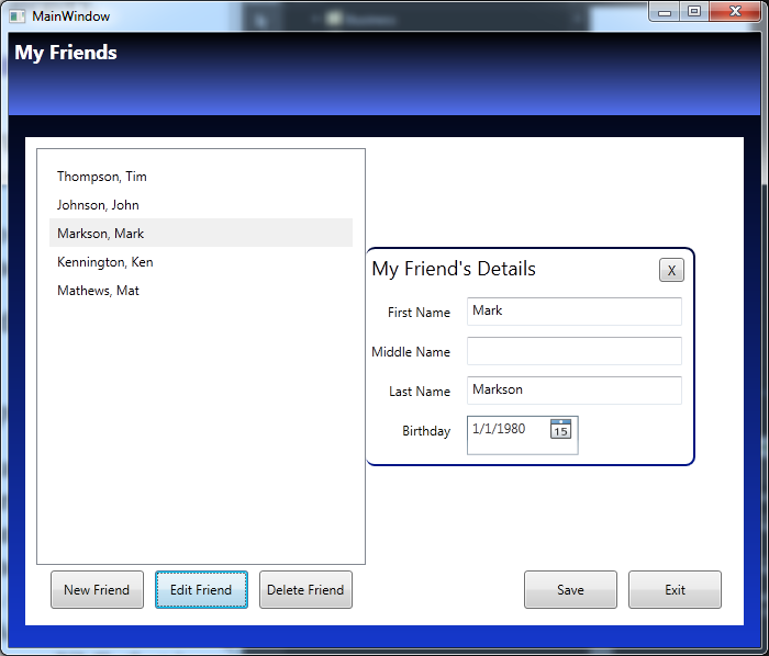
Ok…so I created a simple WPF and MVVM application called My Friends.  This is just a simple applications, the main goal was not to create a My Friend app, but do demonstrate how to make an edit box slide in an out.

The application is too big to give you step by step instructions to create the whole application, so instead, I am going to make it available for download and then tell you how to see the changes.

  1. Download and extract the solution from the link below:
    MyFriends.zip
  2. Open the project in Expression Blend (not Visual Studio).
  3. Get to know the Application. (Ok, I guess you could do this part in Visual Studio…but the intent is to learn an Expression Blend feature.)
    Check out the Person and PersonCollection classes in the Model folder.
    Check out the Views and the corresponding ViewModels and look at the binding statements.
    The MVVM folder has some standard MVVM classes, that if you know MVVM you should be familiar with.
    The business has an XML Serialization helper class.
    The data folder contains an XML that is serialized from the PersonCollection class.
  4. In Expression Blend, open the View\FriendListView.xaml.
  5. In the Objects and Timeline tab, get to know the assets that are being used. (I think they are all standard assets. I don’t think I am using anything that doesn’t come with .NET and Expression Blend by default.)
  6. In the Objects and Timeline tab, specifically look at the PersonDetailsView object.
    Notice it is behind the FriendList.
    This is the edit box that is animated and it will slide to the right when you click edit.
  7. Go to the States tab.
    Look a the State group that is created. There are two groups: EditFriendOpenState and EditFriendClosedState.  The names should be obvious.
    Notice the Transition duration is set to .5 and notice the Easing function.
  8. There is a behavior or action called GoToStateAction that was dragged over the Edit button and configured to change the state to EditFriendOpenState.
  9. The GoToStateAction was also dragged over the X button on the edit page and configured to change the state toEditFriendClosedState.
  10. Build the application and see how the state changes and how it uses the Easing function for .5 seconds to slide the edit field out.

Here is a sample image:

Anyway, I hope you find this a fun sample application to learn with.


This project is also an example of:

  • Basic C#
  • Xml Serialization
  • MVVM (including ICommand and RelayCommand with buttons)
  • Using Data Converters (as one converter is used)

Exercises for further learning:

LINQ exercise

  • There is a comment in the View\FriendListView.xaml that uses LINQ, but there is a reason LINQ wasn’t used, can you determine the reason.
  • What would you have to do to use LINQ and make the application work?

DateTime exercise

  • There is an Age property that was left commented out.  Uncomment it, make it read-only and make it provide the correct number in years based on the Birthday.

How to make a transparent cube in Expression Design

In order to provide a good example of using the polygon and square tool, here is how to make a square look 3D.  Be aware that is a 2D image made to look like 3D.

Transparent Cube

What you will learn

  • Using the rectangle tool
  • Using the polygon tool
  • Make edges by simply using slight color variations
  • Transparency
  • Front vs back placement of element

Step 1 – Create a new Expression Design document

  1. Open Expression Design and click File | New.
  2. Name the file TransparentSquare.design (or whatever name you would like).
    Note: I used a custom width and height of 300x 300, and left the resolution at 96.
  3. Click OK.

Step 2 – Create the first square

This first square will be the face of the cube.

  1. Click the Rectangle on the ToolBox.
    Note: If you cannot find it, try pressing “M” as that is the shortcut key.
  2. Draw a rectangle on the screen while holding down the shift key(the shift key is what tells Expression Design that you are looking for a perfect square and not a rectangle).
    Note: The X and Y placement of the square are: 131.5, 160. The width and height of my square are both 200.2 px. The Rotation Angle and Skew Angle are both 0.
  3. With the square selected, go to the properties tab.
  4. Under Appearance, click the Fill tab.
    Note: Hold your cursor over the tab and it will tell you which tab is the Fill tab and which is the Stroke tab.
  5. Select the Gradient option.
    Note: It is the bottom left of the four boxes just left of the color boxes. Once you click this, you will have a gradient bar.
  6. To the right of the gradient bar, there are two gradient options: Linear Gradient, Radial Gradient.
    Choose Linear Gradient.
  7. On the gradient bar, you should see two markers (squares with a triangle on top).
    Click the left marker and set the color to a nice blue.
    I used #5A78D8.
  8. Click the right marker and set the color to a blue that is darker than the first one you selected.
    Note: I used color #153FC4.
  9. Click the Stroke tab.
  10. Under the Stroke tab and all the way under the color picker, look for a drop down menu. (By default this menu has an image of a black line but can have many options.)
  11. Change it to No Stroke.
  12. Change the Stroke Width to 0 px.
  13. For Transparency, there is an Opacity setting. In case you didn’t know, Opacity is the antonym of Transparent, so setting the Opacity to 90% would be the same as setting a Transparency of 10%.
    Set the Opacity to 90%.

Step 3 – Create the right side of the cube using the Polygon tool

  1. Click the Polygon on the ToolBox.
    Note: If you cannot find it, try pressing “J” as that is the shortcut key.
  2. Draw a polygon on the screen just to the right of the square.
    The size doesn’t really as it will get its size as we move the corners into place.
    Note: The width and height of my square are both 200.2 px.
  3. With the polygon selected, go to the properties tab.
  4. Changes the points from 4 (there are only 3 points by default).
  5. Click Direct Selection on the ToolBox.
    Note: If you cannot find it, try pressing “A” as that is the shortcut key.
  6. Click the bottom left corner of the Polygon and drag it to exactly the bottom right corner of the first square.
    Note: Zooming in can really help you get the corners to line up.
  7. Click the top left corner of the Polygon and drag it to exactly the top right corner of the first square.
  8. Make sure the left side line of the polygon is perfectly straight up and down to match the square.
  9. Click the top right corner of the polygon and drag somewhere up and to the right at an angle that seems to be a good perspective angle.
  10. Click the top right corner of the polygon and drag somewhere up and to the right at an angle that seems to be a good perspective angle, probably a little bit sharper an angle than the top angle.
  11. Make sure the right side line of the polygon is perfectly straight up and down to match the square
  12. Remove the Stroke.  You should already know how to do this now.
  13. Set the Fill to a single color that is a slight variation of the blue we used for the face of the square.
    Note: I used #002DB8.
  14. Set the Opacity to 90%.

Step 4 – Create the top side of the cube using the polygon tool

Note: These steps are a little more general as you have already performed these above.

  1. Click the Polygon on the ToolBox.
  2. Draw a polygon on the screen just to the top of the square face.
  3. Changes the points from 4 (there are only 3 points by default but since you already chose 4 it maybe is chosen for you now).
  4. Click Direct Selection on the ToolBox.
  5. Move the four corners of the polygon into place.  Three of the corners are already positioned for you. Only the top left corner is not.  Make sure to give it a little more angle to make the perspective look right.
  6. Remove the Stroke.
  7. Set the Fill on top to gradient and use a lighter blue.
    Note: I used#92A7EB for the left gradient stop and #7B97EB for the right gradient stop.
  8. Set the Opacity to 90%.

Step 5 – Create a the back of the cube

Ok, well only give a few steps this time. You should be able to do this without perfect step by step instructions, now.

  1. Copy and paste the square face (that way you get the Stroke and Fill and Opacity settings already configured).
  2. Notice that three of the corners are placed for you so you can simply resize the new a square and connect it to the three corners.
  3. You may find that this doesn’t look quite right because this square is in front of the other items you have already created.  Right-click on it and choose Arrange | Send to back.

Step 6 – Create the left side of the cube using the polygon tool

Ok, you now have created two polygon sides. You now need to create a third.  No hand-holding this time.  Just create it very similar to how you created the previous two.  It would be nice if you could just copy the right polygon and have it fit perfectly but it doesn’t fit.  Do you know why? That is right, due to perspective the angle is different so the left side is a little bigger than the right side.  However, you can still use copy and paste, you just have to place the corners.

You don’t need to create a bottom for the cube because it just appears to be already created due to transparency.

You are finished!

Click the Sphere to download a zip file containing: BlueSphere.design, a BlueSphere.png and a BlueSphere.xaml.

Transparent Cube


Download


Expression Studio Training Videos – A check list of videos from Expression.Microsoft.com

There are a lot of free training videos at the Expression 4 web site. However, this web site has two problems:

  1. The videos aren’t necessarily in order.
  2. There is not defined method to track your learning progress as you watch them.

Well, now it is easy. Just copy and paste this page, or easier, download this Excel document:

Expression Training Videos.xls

You can now track you progress as you self-train and go through the Expression 4 training videos.

Training Subjects


Expression Studio

Introducing Expression 4 (eight videos)
Completed Introduction Videos
Introduction to Expression Studio Ultimate
Introduction to Expression Web
Introduction to Expression Blend
Introduction to SketchFlow, a feature of Expression Studio Ultimate
Introduction to Expression Encoder Pro
Expression Web Demo Overview
Expression Blend and SketchFlow Demo Overview
Expression Encoder Pro Demo Overview
Getting Started with Silverlight – For Designers (eleven video series)
Completed Beginner Videos
What is Silverlight? An Overview
Understanding and Working with XAML Code in Expression Blend
Creating Vector-Based Artwork with Expression Design
Applying Color and Effects to Projects using Expression Design
Organizing Your Project using Layout Containers in Expression Blend
Editing the Appearance of Your Project Items using Expression Blend
Exploring the Objects and Timeline Task Pane in Expression Blend
Customizing Silverlight Video Players using Expression Blend
Optimizing Video for Silverlight Playback using Expression Encoder
Adding Interactivity to Silverlight Projects using Expression Blend
Publishing Silverlight Projects to the Web using Expression Blend
Getting Started with Standards-Based Design (ten video series)
Completed Training
Understanding the Benefits of Standards-Based Design with Expression Web
Styling Text using CSS with Expression Web
Understanding CSS Pseudo Classes for Styling Links using CSS with Expression Web
Understanding CSS Margins and Padding with Expression Web
Using CSS Positioning for Layout with Expression Web
Adding Background Images Using CSS with Expression Web
Using CSS Floats to Create Flexible Page Layouts with Expression Web
Clearing CSS Floats with Expression Web
Adding JavaSript to Your Site with Expression Web
Using External CSS Stylesheets with Expression Web


Prototyping

Additional Expression Blend Training Videos
Download the assets, step-by-step guide, and video package (127MB)
Completed Training
Introducing SketchFlow with Expression Blend 3
Adding Navigation Screens in SketchFlow with Expression Blend 3
Building Basic Layout in SketchFlow with Expression Blend 3
Using SketchStyle Controls to Enhance a SketchFlow Layout with Expression Blend 3
Working with Components in a SketchFlow Project with Expression Blend 3
Adding Navigation to Buttons in SketchFlow with Expression Blend 3
Working with States in SketchFlow with Expression Blend 3
Working with the SketchFlow Animation Panel with Expression Blend 3
Working with Behaviors in SketchFlow with Expression Blend 3
Using Sample Data in SketchFlow with Expression Blend 3
Exporting your SketchFlow project with Expression Blend 3
Adding Feedback and Annotations in the SketchFlow Player with Expression Blend 3


Additional Videos


Additional Expression Blend Training Videos
Completed Training
Displaying Dynamic Content in Silverlight using Expression Blend
Understanding and Managing Silverlight Resources with Expression Blend
Making Silverlight Objects Appear Transparent over HTML using Expression Blend
Creating a Template for a ScrollBar with Expression Blend
Customizing an Expression Encoder Template using Expression Blend
Creating Animated XAML Overlays for Expression Encoder using Expression Blend and Design
Customizing a Silverlight Template with Expression Blend
Customizing the Look of a Radio Button in Expression Blend
Customizing the Look of a Listbox in Expression Blend
Creating a Calculator with Expression Blend
Using Runtime Storyboarding in Expression Blend
Creating User Controls in Expression Blend
Reusing and Customizing User Controls in Expression Blend
Making a Slider Control in Expression Blend
Exploring XAML Layout Controls in Expression Blend
Using the Breadcrumb Trail in Expression Blend
Using Vertex Animation with Expression Blend
Using the Border Control in Expression Blend
Using the GridLayout Panel in Expression Blend
Using the Layout Stack Panel in Expression Blend
Using the Binding Scrollbar in Expression Blend
Creating Visual Transitions in Expression Blend
Use an In-State Animation To Make a Silverlight 2 Button Pulse While Focused
Customize The Check Mark In a Silverlight 2 CheckBox
Add States to a UserControl for Silverlight 2
Create Custom Buttons for Silverlight 2
Create and Edit Clipping Paths in Blend
Use the Key Spline Editor in Blend
Create the Wet Floor Effect in Expression Blend
Customize Expression Media Silverlight Templates Using Blend
Working with 3D Cameras in Expression Blend
Working With 3D Materials in Expression Blend
Importing and Manipulating 3D Objects in Expression Blend
Create User Controls in Expression Blend
Working With Clipping Paths in Expression Blend
Using an ObjectDataSource in Expression Blend
Creating a Control Template in Expression Blend
Introduction to Styles
Using Expression Design to Generate XAML Resources for Expression Blend
Motion Paths
Sharing Styles Among Heterogeneous Elements
Basic Animation
Timeline Interpolation
Working with the Grid Panel
Adding Video
Creating and Using an XMLDataSource
Create Data Templates
Creating and Using Brush Resources in Expression Blend
Introducing Blend and Working with Control Editing
Using Databinding with External Data
3D Animation and Event Triggers
Databinding to Control Properties
Designer and Developer Collaboration and Additional Demos


Beehive Game

Additional Expression Blend Training Videos
Download the assets, step-by-step guide, and video package (104 MB)
Completed Training
Organizing and Importing Assets into Expression Blend 3
Creating the BeeHive Game Interface Using Expression Blend 3
Understanding Layout Containers with Expression Blend 3
Creating a User Control with Expression Blend 3
Adding and Applying Behaviors with Expression Blend 3
Adding Game Walls and Creating Animation with Expression Blend 3
Animating Controls with the Visual State Manager with Expression Blend 3
Working with Text and Embedding Fonts with Expression Blend 3
Adding Audio Resources to a Silverlight Game with Expression Blend 3
Publishing and Testing Your Silverlight Game with Expression Blend 3

Well, once you have gone through all these videos you can probably call yourself trained in Application Design using Expression Studio, SilverLight and WPF.

With these skills expect to make between 40k (0-1 years experience) and 80k (5+ years experience).

How to disable row selection in a WPF DataGrid?

Disabling row selection in the WPF DataGrid included in .NET Framework 4 is not really easy. It is extremely difficult to do, unless you have the right tools and know exactly how to do it.

But all the difficulty is in figuring out how to do it. Once you know how to do it, the steps are quite easy to perform.

First, you basically have to use a copy of the default DataGrid style.  However, the easiest way to get a copy of the default DataGrid style is using Expression Blend.

Step 1 – Create a copy of the DataGrid’s default style

I used Expression Blend and .NET 4 to do this first step. Visual Studio 2010 doesn’t have this feature.  However, you don’t need Expression Blend because you can just copy the default style right here from this post.

(This step is a replica of the steps I posted earlier here:
How to create a copy of a control’s default style?)

  1. Open Expression Blend.
  2. Create a new WPF project. (I just used a temp project as I am coding in Visual Studio.)
  3. Add a DataGrid to your MainWindow.xaml.
  4. Right-click on the DataGrid and choose Edit Template | Edit a Copy.
  5. On the Create Style Resource page, click the “New…” button near the bottom right, just to the right of the Resource dictionary option.
  6. In the New Item window, provide a name, such as ResourceDictionaryDataGridSelectDisabled.xaml.
  7. Click OK to create the file and to return the Create Style Resource page.
  8. Make sure Resource dictionary is selected (it should be) and click OK.

You have now created a copy of the DataGrid’s default style as a Resource Dictionary file.

Note: Now that you have the DataGrid’s default style in a file, you can copy it to the project you are really working on.  I am not going to walk you through this.

Step 2 – Edit the DataGrid Style

On line 66, there is an ItemsPresenter object.  Set IsHitTestVisible="False" on this line as shown below. This is the only edit I have done.

Note: Notice I did not add an x:Key so that it will become the default style for any object that has access to this resource dictionary.

<ResourceDictionary
	xmlns="http://schemas.microsoft.com/winfx/2006/xaml/presentation"
	xmlns:x="http://schemas.microsoft.com/winfx/2006/xaml"
	>
	<Style TargetType="{x:Type DataGrid}">
		<Setter Property="Background" Value="{DynamicResource {x:Static SystemColors.ControlBrushKey}}"/>
		<Setter Property="Foreground" Value="{DynamicResource {x:Static SystemColors.ControlTextBrushKey}}"/>
		<Setter Property="BorderBrush" Value="#FF688CAF"/>
		<Setter Property="BorderThickness" Value="1"/>
		<Setter Property="RowDetailsVisibilityMode" Value="VisibleWhenSelected"/>
		<Setter Property="ScrollViewer.CanContentScroll" Value="true"/>
		<Setter Property="ScrollViewer.PanningMode" Value="Both"/>
		<Setter Property="Stylus.IsFlicksEnabled" Value="False"/>
		<Setter Property="Template">
			<Setter.Value>
				<ControlTemplate TargetType="{x:Type DataGrid}">
					<Border BorderBrush="{TemplateBinding BorderBrush}" BorderThickness="{TemplateBinding BorderThickness}"
						Background="{TemplateBinding Background}" Padding="{TemplateBinding Padding}" SnapsToDevicePixels="True">
						<ScrollViewer x:Name="DG_ScrollViewer" Focusable="false">
							<ScrollViewer.Template>
								<ControlTemplate TargetType="{x:Type ScrollViewer}">
									<Grid>
										<Grid.ColumnDefinitions>
											<ColumnDefinition Width="Auto"/>
											<ColumnDefinition Width="*"/>
											<ColumnDefinition Width="Auto"/>
										</Grid.ColumnDefinitions>
										<Grid.RowDefinitions>
											<RowDefinition Height="Auto"/>
											<RowDefinition Height="*"/>
											<RowDefinition Height="Auto"/>
										</Grid.RowDefinitions>
										<Button Command="{x:Static DataGrid.SelectAllCommand}" Focusable="false"
											Style="{DynamicResource {ComponentResourceKey ResourceId=DataGridSelectAllButtonStyle,
													TypeInTargetAssembly={x:Type DataGrid}}}"
											Visibility="{Binding HeadersVisibility, ConverterParameter={x:Static DataGridHeadersVisibility.All},
														 Converter={x:Static DataGrid.HeadersVisibilityConverter},
														 RelativeSource={RelativeSource AncestorType={x:Type DataGrid}}}"
											Width="{Binding CellsPanelHorizontalOffset,
													RelativeSource={RelativeSource AncestorType={x:Type DataGrid}}}"/>
										<DataGridColumnHeadersPresenter x:Name="PART_ColumnHeadersPresenter" Grid.Column="1"
											Visibility="{Binding HeadersVisibility, ConverterParameter={x:Static DataGridHeadersVisibility.Column},
														 Converter={x:Static DataGrid.HeadersVisibilityConverter},
														 RelativeSource={RelativeSource AncestorType={x:Type DataGrid}}}"/>
										<ScrollContentPresenter x:Name="PART_ScrollContentPresenter"
											CanContentScroll="{TemplateBinding CanContentScroll}" Grid.ColumnSpan="2" Grid.Row="1"/>
										<ScrollBar x:Name="PART_VerticalScrollBar" Grid.Column="2" Maximum="{TemplateBinding ScrollableHeight}"
											Orientation="Vertical" Grid.Row="1"
											Visibility="{TemplateBinding ComputedVerticalScrollBarVisibility}"
											Value="{Binding VerticalOffset, Mode=OneWay, RelativeSource={RelativeSource TemplatedParent}}"
											ViewportSize="{TemplateBinding ViewportHeight}"/>
										<Grid Grid.Column="1" Grid.Row="2">
											<Grid.ColumnDefinitions>
												<ColumnDefinition Width="{Binding NonFrozenColumnsViewportHorizontalOffset,
																 RelativeSource={RelativeSource AncestorType={x:Type DataGrid}}}"/>
												<ColumnDefinition Width="*"/>
											</Grid.ColumnDefinitions>
											<ScrollBar x:Name="PART_HorizontalScrollBar" Grid.Column="1" Maximum="{TemplateBinding ScrollableWidth}"
												Orientation="Horizontal" Visibility="{TemplateBinding ComputedHorizontalScrollBarVisibility}"
												Value="{Binding HorizontalOffset, Mode=OneWay, RelativeSource={RelativeSource TemplatedParent}}"
												ViewportSize="{TemplateBinding ViewportWidth}"/>
										</Grid>
									</Grid>
								</ControlTemplate>
							</ScrollViewer.Template>
							<ItemsPresenter SnapsToDevicePixels="{TemplateBinding SnapsToDevicePixels}" IsHitTestVisible="False"/>
						</ScrollViewer>
					</Border>
				</ControlTemplate>
			</Setter.Value>
		</Setter>
		<Style.Triggers>
			<Trigger Property="IsGrouping" Value="true">
				<Setter Property="ScrollViewer.CanContentScroll" Value="false"/>
			</Trigger>
		</Style.Triggers>
	</Style>
	<!-- Resource dictionary entries should be defined here. -->
</ResourceDictionary>

Step 3 – Configure the DataGrid to use the new style

Now that you have your new style in a resource dictionary (and I assume you have already added the file you created in Step 1 to your project), you can add the ResourceDictionary to the DataGrid’s object under DataGrid.Resources as shown.

<DataGrid ... />
    <DataGrid.Resources>
        <ResourceDictionary>
            <ResourceDictionary.MergedDictionaries>
                <ResourceDictionary Source="ResourceDictionaryDataGridSelectDisabled.xaml" />
            </ResourceDictionary.MergedDictionaries>
        </ResourceDictionary>
    </DataGrid.Resources>
</DataGrid>

I hope this helps you have some more success with a DataGrid from day one as it took me some time to get this working.

How to create a copy of a control’s default style?

Sometimes you need to make some advanced styling changes to a default control, such as a RadioButton, ListBox, DataGrid, Button, etc. However, you may want to keep the majority of the default style the way it is.

In Expression Blend, this is easy to do.  If you don’t have Expression Blend and you are developing in WPF, get it immediately.  There is a trial version you can test out.

Here is how to get your copy of any control’s default style.

  1. Open Expression Blend.
  2. Create a new WPF project. (It is just a temp project.)
  3. Add the default control to your MainWindow.xaml.
  4. Right-click on the control and choose Edit Template | Edit a Copy.
  5. On the Create Style Resource page, click the “New…” button near the bottom right, just to the right of the Resource dictionary option.
  6. In the New Item window, provide a name that is meaningfule.
  7. Click OK to create the file and to return the Create Style Resource page.
  8. Make sure Resource dictionary is selected (it should be) and click OK.

You have now created a copy of the default style of the control.  You now have power to manipulate the control in advanced ways.

Important! Be aware that some controls and made up of other controls, and often you have to do this for each control that your control uses.  For example, a DataGrid has many different subcomponents such as a ScrollViewer, an ItemsPresenter, Grids, etc…

How to configure the WPF RadioButton's circle bullet top aligned when there are multiple lines of text?

Today I had to solve a problem that appeared quite difficult, but turned out to not be so hard if I let Expression Blend do most the work and finish it up in the XAML. I ended up having to completely recreate the default template style and then modify it.

Note: This article could also be titled: How to change the default template style of a standard control?

I had a RadioButton with text that wraps and it wasn’t displaying exactly how my team wanted. Here is the XAML.

<Window x:Class="RadioButtonTopAligned.MainWindow"
        xmlns="http://schemas.microsoft.com/winfx/2006/xaml/presentation"
        xmlns:x="http://schemas.microsoft.com/winfx/2006/xaml"
        Title="MainWindow" Height="350" Width="525">
    <Grid>
        <RadioButton GroupName="RadioButtonList">
            <Label>
                <AccessText TextWrapping="Wrap" Text="_This is a very long radio button control line of text that should wrap." MaxWidth="300"/>
            </Label>
        </RadioButton>
    </Grid>
</Window>

The problem is that the circle bullet is center aligned like this:

Notice how the circle bullet is aligned in between the two lines of text. I need it to be top aligned like this:

Notice how the circle bullet is aligned with the top line of text. I need to get WPF to do this.

From a Visual Studio 2010 point of view, there is no easy way to do this. At first I thought it would be a simple dependency property, but it isn’t. An quick internet search led me to realize that I have to pretty much re-style the whole RadioButton. This sounds really hard and in fact, in Visual Studio, without help, it would be really hard. You would have to have the code for the default template style for the RadioButton control memorized.

Here is an forum post I found from MSDN: How do I make a RadioButton’s Bullet align top

While the post is exactly what I was looking for and has an answer, I didn’t at first grasp the answer. I wasn’t sure what was going on until one of my co-workers, Shawn, who is more skilled in Expression Blend, showed me. Now that I understand, I want to make sure the next person who finds the same forum post on MSDN can understand even easier by writing this article and adding it to the forum post.

This is where Expression Blend comes in. If you don’t have Expression Blend, don’t worry, you can still get through this article as I will include the the default style code that Expression Blend created for me right here in my post.

In Expression Blend, this is what to do.

  1. Create a blank WPF project in Expression Blend.
  2. Add a RadioButton.
  3. Right-click on the RadioButton and choose Edit Template | Edit a Copy…
  4. Click OK on the Create Style Resource window.

Here is what happens to your XAML and you can do this to the XAML in you project manually if you don’t have Expression Blend.

  1. The following reference is added to the project: PresentationFramework.Aero
  2. The same is referenced in the XAML (See line 4 of the XAML below)
  3. The default RadioButton style is copied to your XAML under the Window.Resources element.  (See lines 10-48 in the XAML below)
  4. The RadioButton is assigned the style created. (See line 51 in the XAML below)
<Window
	xmlns="http://schemas.microsoft.com/winfx/2006/xaml/presentation"
	xmlns:x="http://schemas.microsoft.com/winfx/2006/xaml"
	xmlns:Microsoft_Windows_Themes="clr-namespace:Microsoft.Windows.Themes;assembly=PresentationFramework.Aero"
	x:Class="RadioButtonTopAligned_EB.MainWindow"
	x:Name="Window"
	Title="MainWindow"
	Width="640" Height="480">

	<Window.Resources>
		<SolidColorBrush x:Key="CheckBoxStroke" Color="#8E8F8F"/>
		<Style x:Key="CheckRadioFocusVisual">
			<Setter Property="Control.Template">
				<Setter.Value>
					<ControlTemplate>
						<Rectangle Margin="14,0,0,0" SnapsToDevicePixels="true" Stroke="{DynamicResource {x:Static SystemColors.ControlTextBrushKey}}" StrokeThickness="1" StrokeDashArray="1 2"/>
					</ControlTemplate>
				</Setter.Value>
			</Setter>
		</Style>
		<Style x:Key="RadioButtonStyle1" TargetType="{x:Type RadioButton}">
			<Setter Property="Foreground" Value="{DynamicResource {x:Static SystemColors.ControlTextBrushKey}}"/>
			<Setter Property="Background" Value="#F4F4F4"/>
			<Setter Property="BorderBrush" Value="{StaticResource CheckBoxStroke}"/>
			<Setter Property="BorderThickness" Value="1"/>
			<Setter Property="Template">
				<Setter.Value>
					<ControlTemplate TargetType="{x:Type RadioButton}">
						<BulletDecorator Background="Transparent">
							<BulletDecorator.Bullet>
								<Microsoft_Windows_Themes:BulletChrome BorderBrush="{TemplateBinding BorderBrush}" Background="{TemplateBinding Background}" IsChecked="{TemplateBinding IsChecked}" IsRound="true" RenderMouseOver="{TemplateBinding IsMouseOver}" RenderPressed="{TemplateBinding IsPressed}"/>
							</BulletDecorator.Bullet>
							<ContentPresenter HorizontalAlignment="{TemplateBinding HorizontalContentAlignment}" Margin="{TemplateBinding Padding}" RecognizesAccessKey="True" VerticalAlignment="{TemplateBinding VerticalContentAlignment}"/>
						</BulletDecorator>
						<ControlTemplate.Triggers>
							<Trigger Property="HasContent" Value="true">
								<Setter Property="FocusVisualStyle" Value="{StaticResource CheckRadioFocusVisual}"/>
								<Setter Property="Padding" Value="4,0,0,0"/>
							</Trigger>
							<Trigger Property="IsEnabled" Value="false">
								<Setter Property="Foreground" Value="{DynamicResource {x:Static SystemColors.GrayTextBrushKey}}"/>
							</Trigger>
						</ControlTemplate.Triggers>
					</ControlTemplate>
				</Setter.Value>
			</Setter>
		</Style>
	</Window.Resources>

	<Grid x:Name="LayoutRoot">
		<RadioButton GroupName="RadioButtonList" Style="{DynamicResource RadioButtonStyle1}">
			<Label>
				<AccessText TextWrapping="Wrap" Text="_This is a very long radio button control line of text that should wrap." MaxWidth="300"/>
			</Label>
		</RadioButton>
	</Grid>
</Window>

Now we can edit the XAML. Below is the same XAML as above with the following edits:

  1. Inside the BulletDecorator.Bullet element on line 30, create a DockPanel around the BulletChrome element.
  2. The ControlPresenter is moved to be inside the DockPanel.
  3. Add the following XAML atrributes to the BulletChrome element:
    VerticalAlignment=”Top” Margin=”0,8,0,0″ Height=”{TemplateBinding FontSize}” Width=”{TemplateBinding FontSize}”

    Note: If you change the font of the text content in the RadioButton, you should change the Margin in the style as well. I haven’t figured out how to make it always match the top line without manually tweaking it when you change the font. Also, if you don’t want the BulletChrome element to be the same size as the font, you will have to tweak Width and Height too.

<Window
	xmlns="http://schemas.microsoft.com/winfx/2006/xaml/presentation"
	xmlns:x="http://schemas.microsoft.com/winfx/2006/xaml"
	xmlns:Microsoft_Windows_Themes="clr-namespace:Microsoft.Windows.Themes;assembly=PresentationFramework.Aero"
	x:Class="RadioButtonTopAligned_EB.MainWindow"
	x:Name="Window"
	Title="MainWindow"
	Width="640" Height="480">

	<Window.Resources>
		<SolidColorBrush x:Key="CheckBoxStroke" Color="#8E8F8F"/>
		<Style x:Key="CheckRadioFocusVisual">
			<Setter Property="Control.Template">
				<Setter.Value>
					<ControlTemplate>
						<Rectangle Margin="14,0,0,0" SnapsToDevicePixels="true" Stroke="{DynamicResource {x:Static SystemColors.ControlTextBrushKey}}" StrokeThickness="1" StrokeDashArray="1 2"/>
					</ControlTemplate>
				</Setter.Value>
			</Setter>
		</Style>
		<Style x:Key="RadioButtonStyle1" TargetType="{x:Type RadioButton}">
			<Setter Property="Foreground" Value="{DynamicResource {x:Static SystemColors.ControlTextBrushKey}}"/>
			<Setter Property="Background" Value="#F4F4F4"/>
			<Setter Property="BorderBrush" Value="{StaticResource CheckBoxStroke}"/>
			<Setter Property="BorderThickness" Value="1"/>
			<Setter Property="Template">
				<Setter.Value>
					<ControlTemplate TargetType="{x:Type RadioButton}">
						<BulletDecorator Background="Transparent">
							<BulletDecorator.Bullet>
								<DockPanel>
									<Microsoft_Windows_Themes:BulletChrome VerticalAlignment="Top" Margin="0,8,0,0" Height="{TemplateBinding FontSize}" Width="{TemplateBinding FontSize}" BorderBrush="{TemplateBinding BorderBrush}" Background="{TemplateBinding Background}" IsChecked="{TemplateBinding IsChecked}" IsRound="true" RenderMouseOver="{TemplateBinding IsMouseOver}" RenderPressed="{TemplateBinding IsPressed}" />
									<ContentPresenter RecognizesAccessKey="True" VerticalAlignment="{TemplateBinding VerticalContentAlignment}"/>
								</DockPanel>
							</BulletDecorator.Bullet>
							</BulletDecorator>
						<ControlTemplate.Triggers>
							<Trigger Property="HasContent" Value="true">
								<Setter Property="FocusVisualStyle" Value="{StaticResource CheckRadioFocusVisual}"/>
								<Setter Property="Padding" Value="4,0,0,0"/>
							</Trigger>
							<Trigger Property="IsEnabled" Value="false">
								<Setter Property="Foreground" Value="{DynamicResource {x:Static SystemColors.GrayTextBrushKey}}"/>
							</Trigger>
						</ControlTemplate.Triggers>
					</ControlTemplate>
				</Setter.Value>
			</Setter>
		</Style>
	</Window.Resources>

	<Grid x:Name="LayoutRoot">
		<RadioButton GroupName="RadioButtonList" Style="{DynamicResource RadioButtonStyle1}">
			<Label>
				<AccessText TextWrapping="Wrap" Text="_This is a very long radio button control line of text that should wrap." MaxWidth="300"/>
			</Label>
		</RadioButton>
	</Grid>
</Window>

I hope this posts clarifies how to completely recreate a template style for a default control to modify something that at first doesn’t appear modifiable.